The logo

The five-dot symbol represents letter W. Symbolically, the dots represent the five continents – with Wallonia located right at their intersection. The .be emphasises the fact that Wallonia belongs to Belgium.
The brand’s tagline or signature indicates openness to the world

The signature is an expression of openness to the world. It invites you to share in that openness, to find your source of inspiration and creativity in Wallonia.
The auras
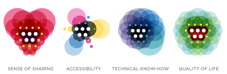
Wallonia’s other strengths are represented symbolically by 4 auras. The auras are not found alone.
Sense of sharing (heart-shaped, with a colour that exudes warmth), accessibility (in the shape of a crossroads), technical know-how (a brain, coloured blue - associated with technology) and high quality of life (vegetable-shaped, with green as predominant colour).
Association of the auras with the brand’s signature